Easy Reference Guide for Interior ADA Signs in Orange County CA
The 2010 ADA Standards for Accessible Design govern a broad range of accommodations that California businesses must make to create inclusive sites. Among them are the design, fabrication, and installation of signage. Because there is much confusion about this aspect of sign purchases, Caliber Signs & Imaging has put together an easy reference guide for interior ADA signs.
Not All Signs Have to Feature ADA-Compliant Braille
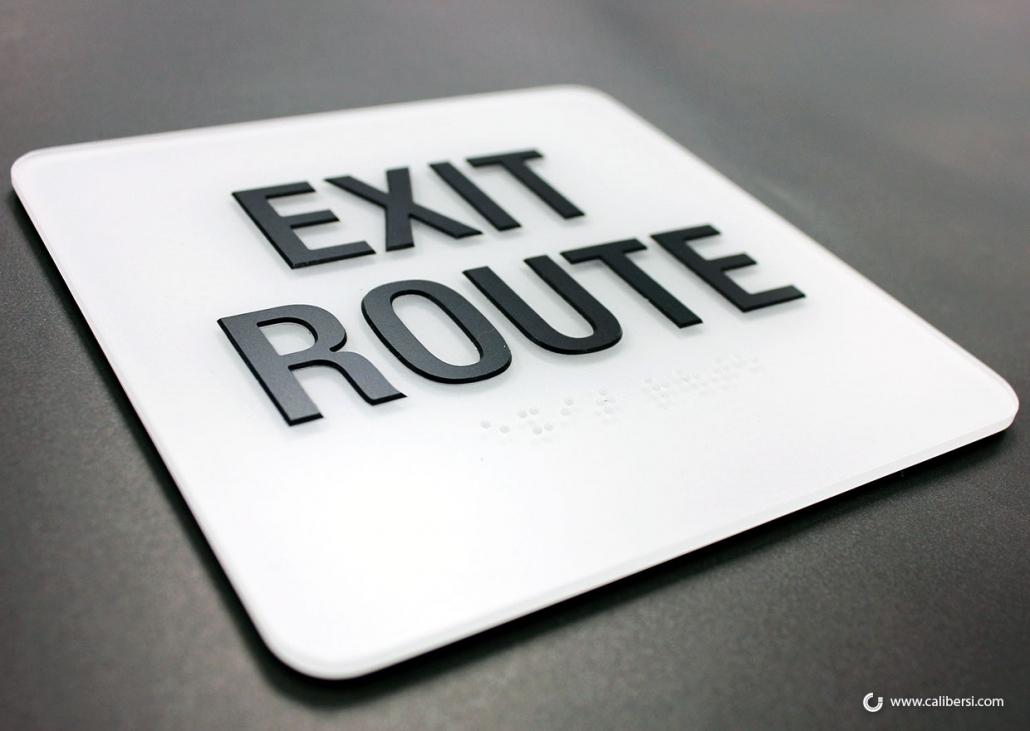
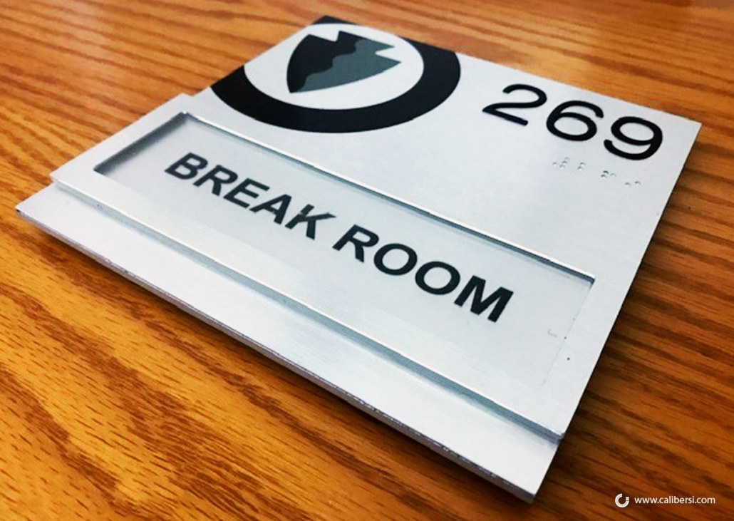
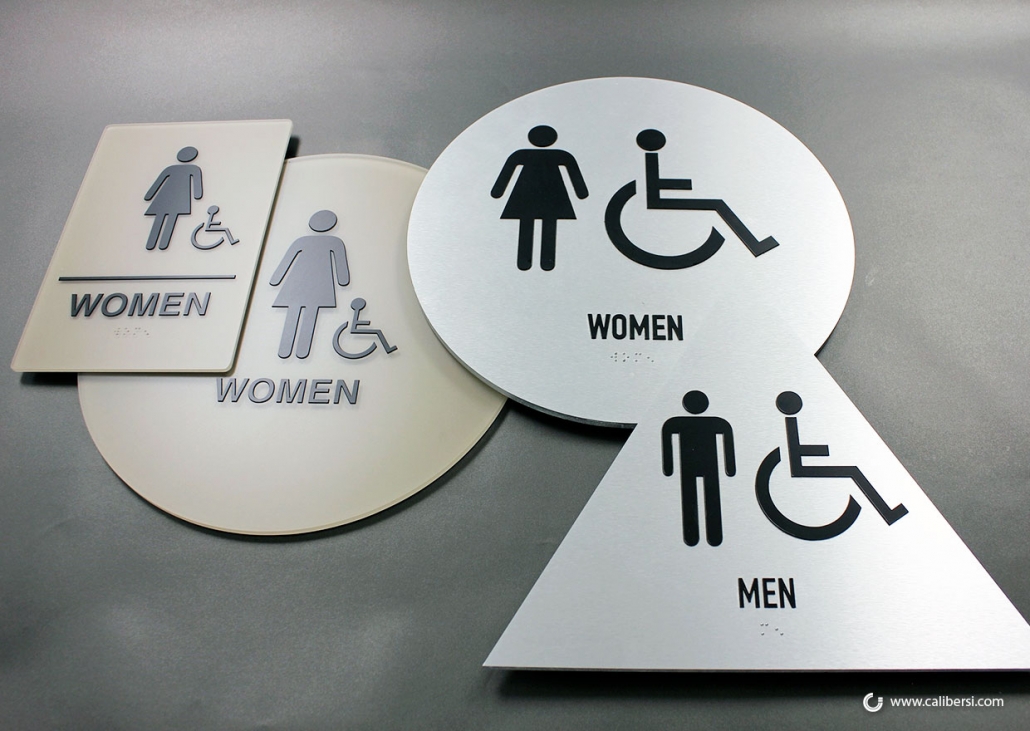
It is a common misconception that every sign must display the Braille II dots you might have seen on some products. Rather, your business can reserve this treatment for designated permanent rooms or exit paths that the public or employees can read and help visually impaired people too. Examples include restrooms, service rooms, meeting rooms, and other publicly accessible sites. In contrast, you do not have to include overhead signs or directories into the ADA treatment.
Color Contrast is a Must
The Standard specifies that there must be a measurable contrast between the characters and symbols on the sign and its background color; for example walls or doors. Light-colored characters contrast nicely with a dark background. However, you do not have to limit yourself to black and white. Silver and black, or your primary brand color and a suitable background tone, could be ideal.
Pay Attention to the Font Details
There are precise rules that apply to the display of the individual letters you place on the signage. For starters, they must display in a Sans Serif font with a medium or bold presentation. Moreover, letters should be uppercase with individual elements measuring between 5/8 inches to two inches in height. Because they must be tactile, they need to have a 1/32-inch thickness. Avoid any specialty scripts or fonts.
Signage Size Depends on Text and Pictogram Use
Our business clients have found it useful to keep ADA-compliant signs brief and succinct. Because any lettering must be repeated with Braille II dots, it is essential not to overwhelm the individual with the message’s details. By the way, the Braille must consist of domed beads that do not have to be painted in the contrasting color play. However, they must be placed directly underneath the letters. We can recommend sizes for the various types of signs.
Avoid the Glare
Some compliant signs have nevertheless slipped into non-compliance because of sunlight or artificial lighting glare. Therefore, we recommend a non-glare or matte finish acrylic that is suitable for making the letters easy to read even from a distance.
The Standards Govern Signage Installation, Too
When the fire marshal inspects your location, they will also look for signs in public spaces to meet specific installation heights. There are plenty of rules that govern the mounting sites. Moreover, California has unique laws that occasionally require two signs for the same space, simply because the state’s rules are stricter than the federal legislation.
Audit Available Upon Request
If you think your building is out of compliance or your need is to revamp the look of the signs to offer a more contemporary look, do not hesitate to contact us and request an audit of all required interior (and exterior) ADA signage for your property.
Confused Even after Reading This Easy Reference Guide for Interior ADA Signs?
Caliber Signs & Imaging can help. Before you leave compliance with the 2010 Standards for California or the federal Americans with Disabilities Act to chance, talk to our experts to learn what you need to do. Our team is familiar with the laws, design requirements, and installation mandates. Moreover, we serve the business communities in and around Orange County, SoCal, and the nation. Call us today at (949) 748-1070!


