10 Tips For Great Sign Design, Including Vehicle Wraps!
1. KEEP IT SIMPLE
When you crowd a sign with too many words or images, it becomes impossible to read it from a distance. We recommend using as few words as possible so your signage is legible and visible. Three to five words are optimal for quick readability. You can also improve readability by leaving 30 to 40 percent of the sign’s face as dead space.
2. GRAB ATTENTION
Your sign should have some characteristic that reaches out and commands attention. The first element that grabs attention should be a large attractive graphic or logo or possibly large dominating text. It should make your location easy to remember while making your products and services enticing and memorable.
3. SAVE THE DETAILS FOR YOUR SALES PITCH
Don’t use your sign to close sales. Save this information for when consumers are in your place of business.
4. TAKE ADVANTAGE OF NEW TECHNOLOGY
With today’s technology, signs are becoming more effective at delivering your key message. Plus, they can make your business a landmark in the community. For instance, whether you choose a menu directory or a large monument outdoor sign, new electronic message centers allow you to change the message on your signage.
5. CONSIDER COLORS CAREFULLY
Too many colors take away from the readability of a sign. Instead, keep it to a few useful colors. Make sure the colors are contrasting. For example, yellow on white is not very readable, while white on red is easy to see. This is why they use these colors for Stop signs. If you have several colors in a graphic, stay away from colored lines of text. Black text is best.
6. KEEP SIGNS NEAR THE VIEWER
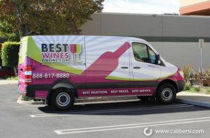
Place your sign as close to the street as you can. You want to make your sign unavoidable for passing viewers. If your building is too far from the main road, consider buying a cost-effective vehicle wrap and strategically parking your car on the street corner in an allocated parking spot.
7. APPEAL TO IMPULSE BUYERS
Many business owners mistakenly think that signs are just devices that identify their place of business. If you run a retail business, you should understand that 55 percent of all sales result from impulse buys. People see, shop, and buy. If a sign is ineffective, it can actually cost you more in lost sales than the full price of a good sign.
8. AVOID OBSTRUCTIONS
Make certain your signage can be viewed from as many angles as possible without obstruction. Determine the most visible location for your marker by driving past your location from all directions. Look out for trees, other signs, vehicles, or building obstructions.
9. PROVIDE A CONSISTENT VISUAL IMAGE
Color is probably the easiest and most affordable element you can manipulate to set your business apart. To do this, you need to ensure your sign’s design stays consistent with your company’s branding as it appears on your other marketing materials. Also, the colors of your building should reinforce the design and colors of your signs.
10. YOUR SIGN IS YOUR HANDSHAKE
The first impressions is always the strongest impression, and this impression tends to last. Your sign is often your first impression and must project the image you want the public to know and remember you by. In fact, people will judge the inside of your business based on how your signage looks on the outside.
If you are looking for sign design services in Irvine, CA, contact the friendly experts at Caliber Signs & Imaging today for a free consultation.


